Course Design & Art Direction
Problem
Our team was tasked with redesigning the existing Color Theory Course for the Los Angeles Film School graphic design bachelor's program. The instructor wanted to move away from the typical bright color theory look found in most third-party content previously used. It was essential for us to limit the use of third-party content, which allowed us to create brand new learning materials.
The students learn the theories and applications of color related to print and digital in the Digital Color Theory course. Students learn how color can impact original design concepts across multiple media types.
Solution
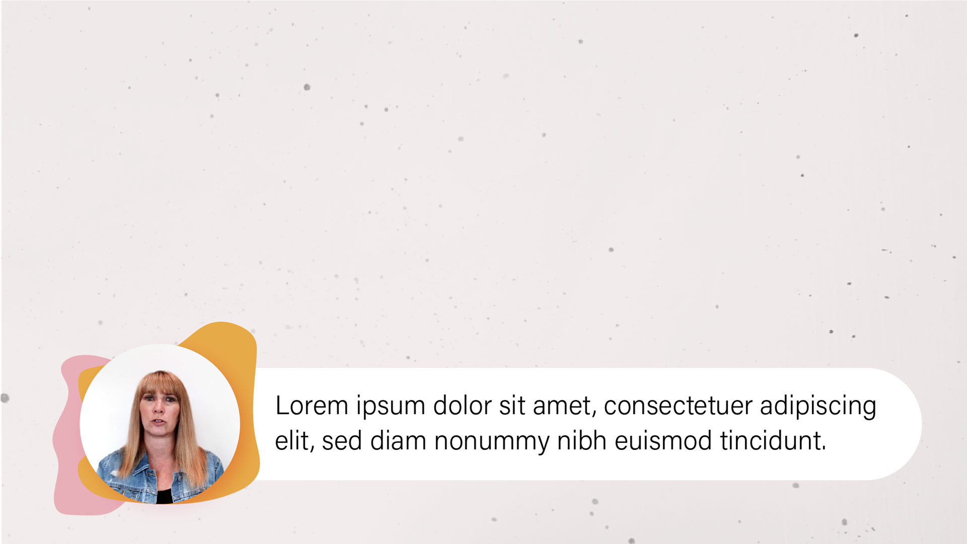
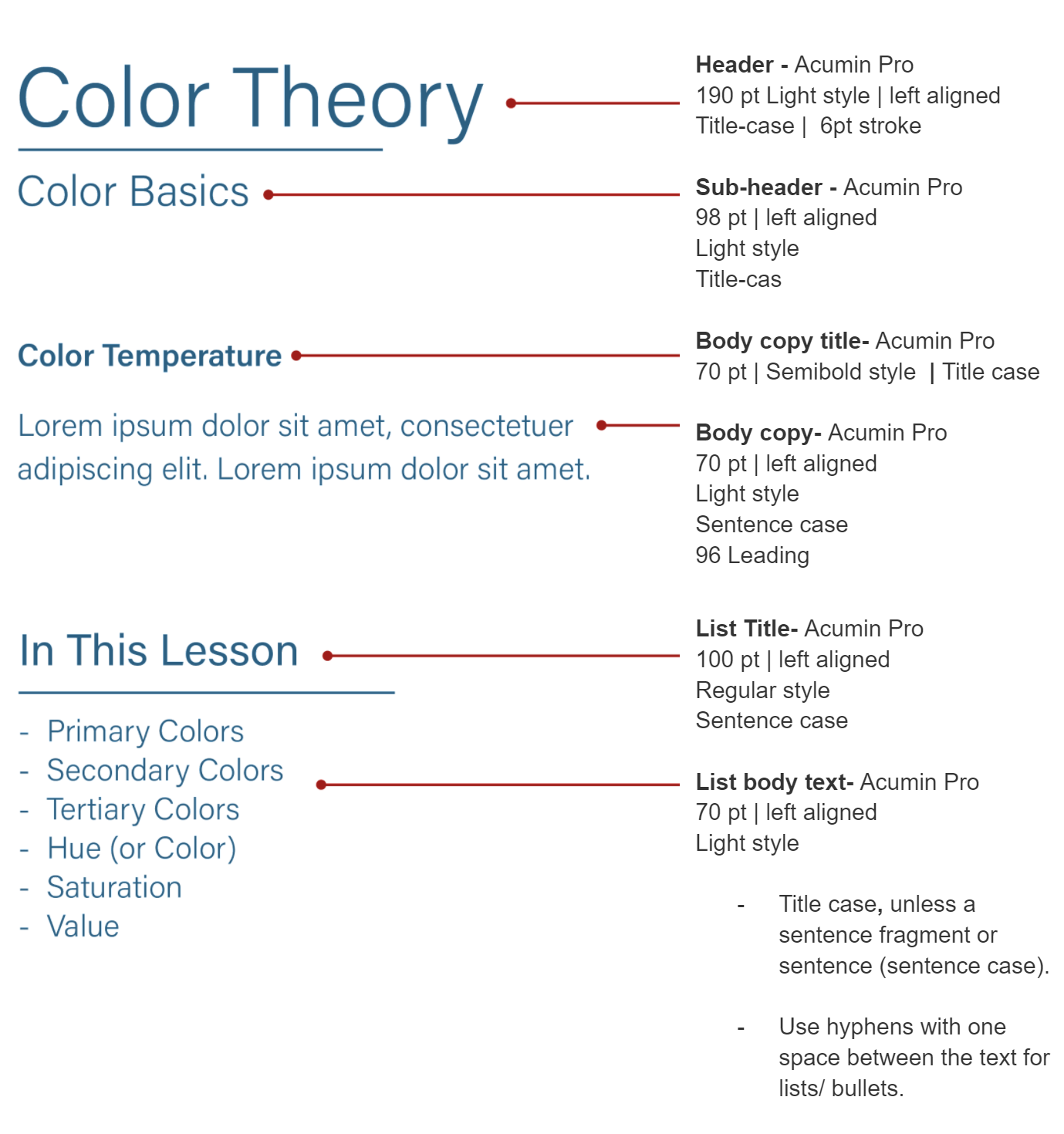
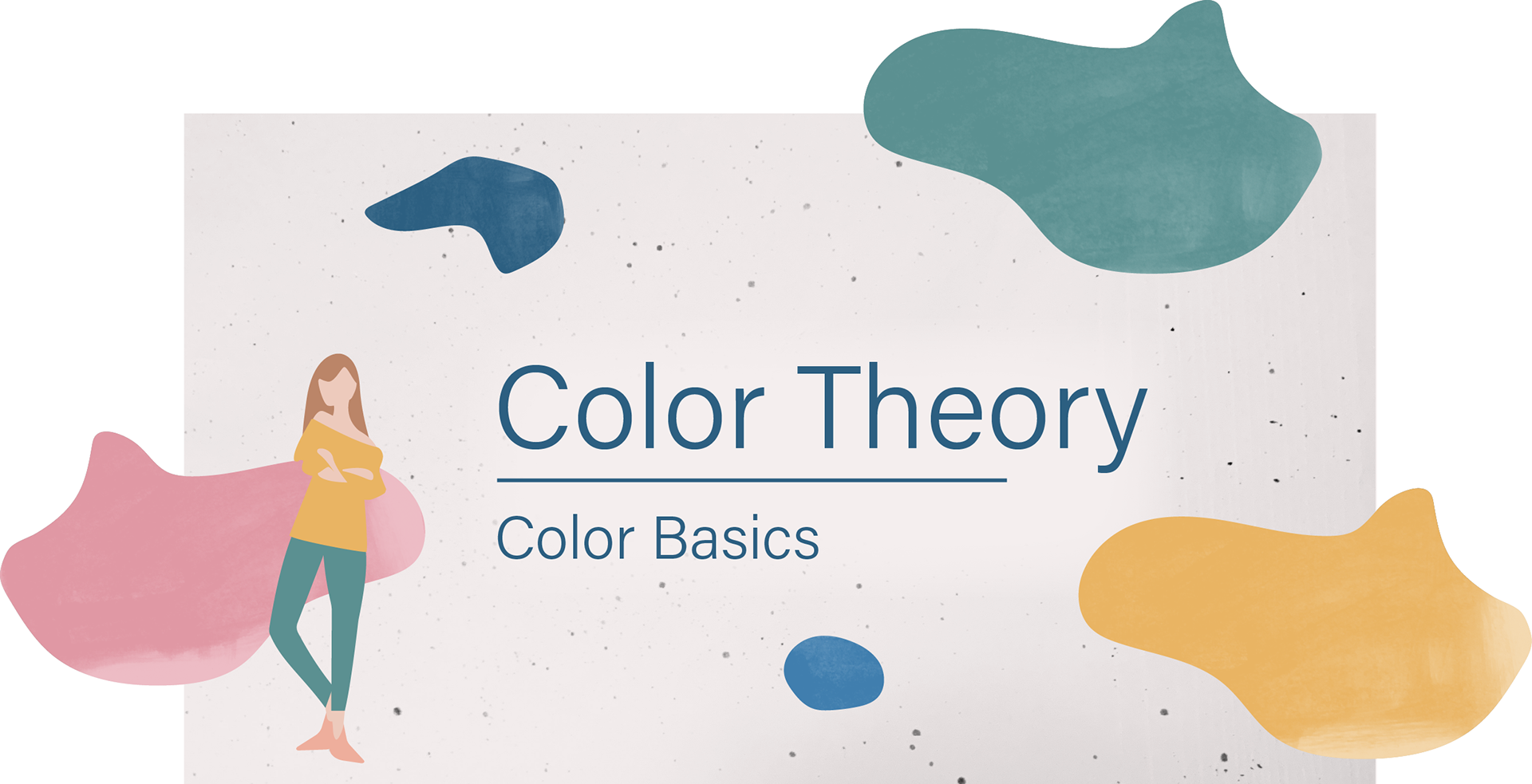
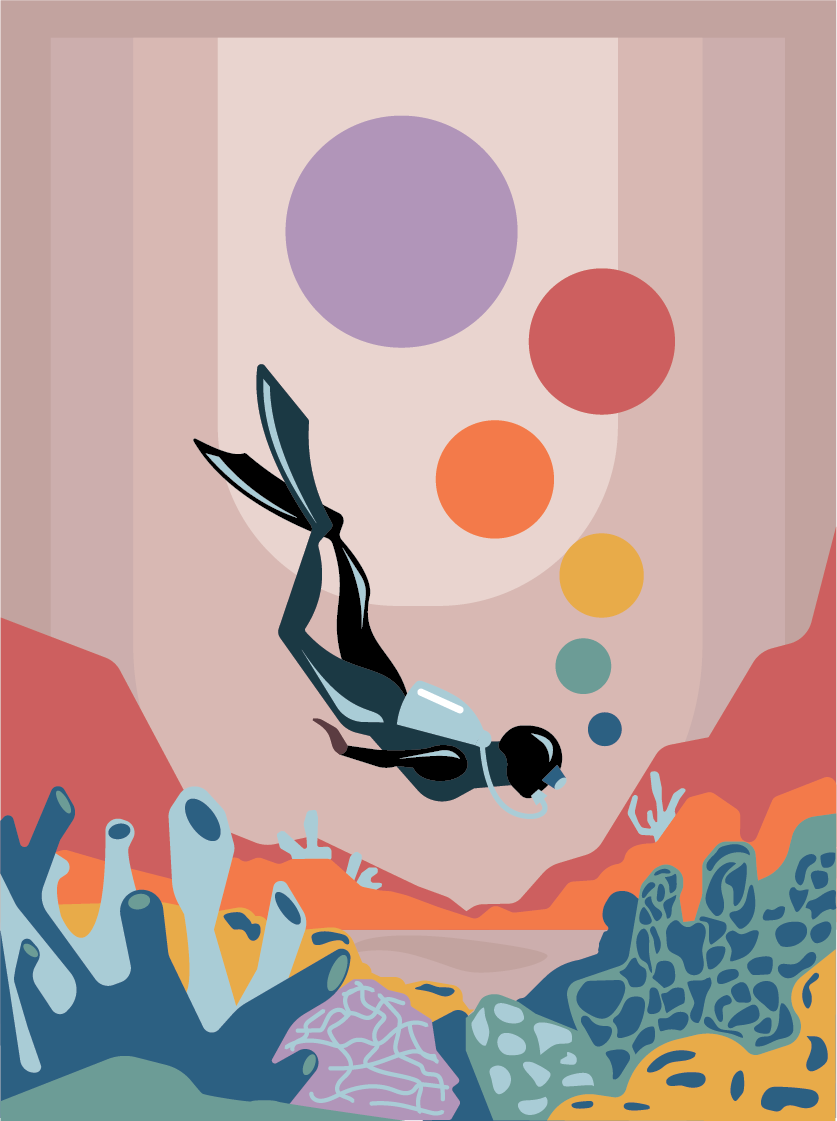
I created a design system that we used on multiple forms of media. Our goal was to spark the learner's curiosity and invite them to think of color in new ways past the bright pigments they'll find on their color wheel. Desaturated bright colors to keep the course fun and playful but refined. The video's abstract minimalism design puts the on-screen text in the spotlight, so the most significant takeaway is understanding the terminology of color theory.


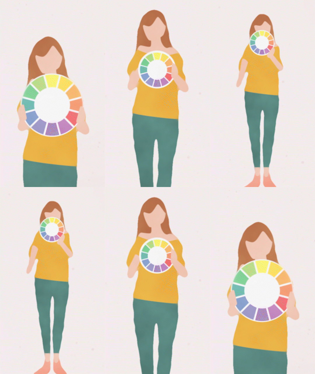
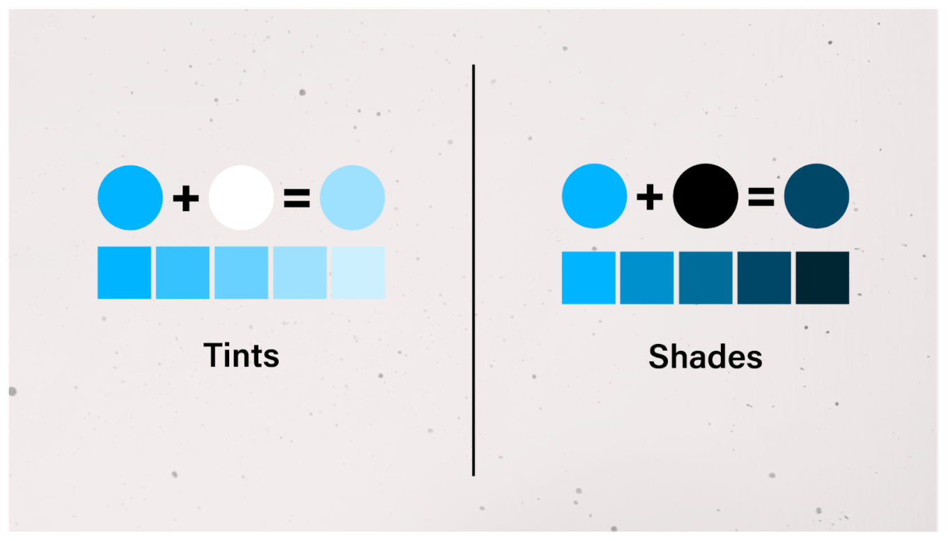
Info-graphic example

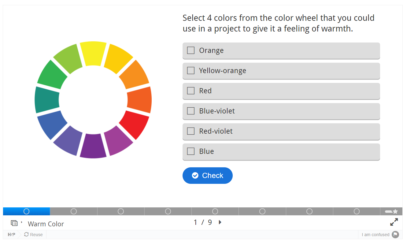
Interactive assignments created using an html application called H5p.
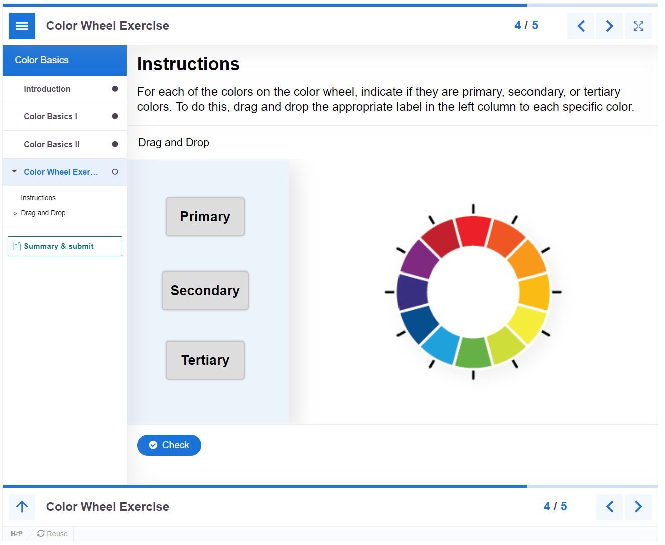
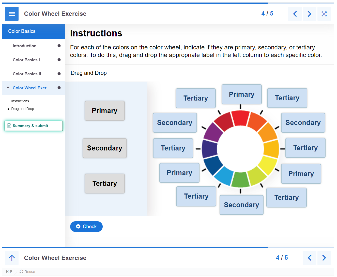
Example of student worksheet


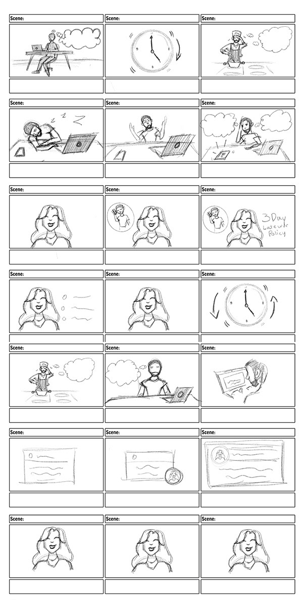
Instructional Videos





Lead Designer for instructional media department at LA Film School highlight reel.
